
4
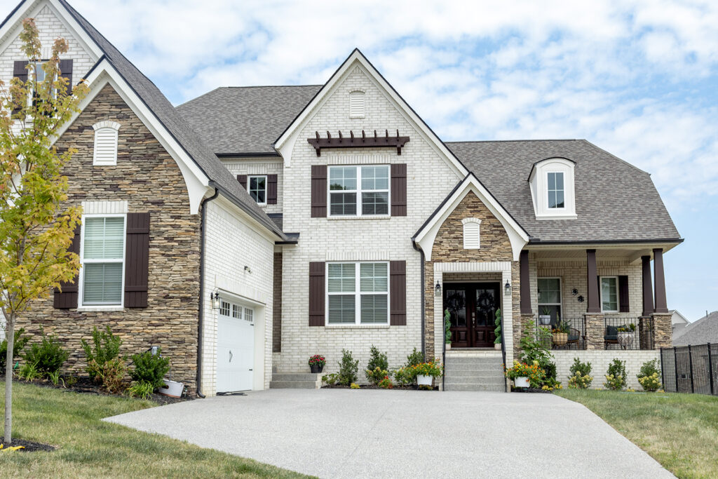
Combining masonry with siding is one of the most enduring architectural choices in American homebuilding. When done well, the pairing creates rich visual depth, balancing the rugged weight of stone and clay with the crisp, clean lines of modern cladding. When done poorly, the result feels disjointed, as if two completely different houses were stitched together at the foundation line.
The most common mistake homeowners make is choosing siding colors in isolation. Siding can be repainted, replaced, or updated relatively easily over the life of a home. Brick, however, is a permanent structural fixture. You never choose brick to match your siding; your brick must always dictate your siding palette. Achieving a balanced, high-end exterior requires looking past the surface color of the wall to analyze undertones, proportion, and natural illumination.
Identify the Hidden Cast: Unlocking Brick Undertones
Homeowners often describe their masonry in broad strokes: red, brown, or tan. In reality, a single brick facade contains an entire ecosystem of pigments, clays, and mineral deposits fired under intense heat. To find siding colors that harmonize rather than clash, you must diagnose the dominant and secondary undertones woven throughout the masonry.
The easiest way to identify these subtleties is to hold a clean, neutral white poster board against your exterior wall in midday sun. The clean contrast will immediately expose the underlying color temperature of your brick.
Red and Terracotta Brick
Classic red brick rarely consists of pure red. It typically leans warm with orange and gold undertones, or cool with violet, blue, or burgundy casts. Pairing an orange-leaning red brick with cool slate-gray siding creates an uncomfortable visual vibrating effect because the warm and cool temperatures fight for dominance. For warm red brick, siding in warm off-whites, creamy linen, or deep bronze works best. Cool red brick pairs exceptionally well with charcoal, deep navy, or balanced greiges that carry faint lavender or taupe bases.
Brown and Buff Brick
Buff, sand, and brown bricks are popular across mid-century ranches and contemporary builds alike. These materials tend to carry heavy yellow, mustard, or olive undertones. The pitfall here is choosing a siding shade that matches the depth of the brick too closely, resulting in a muddy, monotonous exterior. Siding paired with buff brick should either sit distinctly lighter, such as an ivory or alabaster, or distinctly darker, such as rich espresso or forest green, to establish clear boundaries.
Whitewashed and Gray Brick
Tumbled, gray, or slurried brick provides the most neutral backdrop, but it comes with its own hazard: feeling sterile or washed out. When working with gray or white-toned masonry, pair it with siding colors that carry tangible organic warmth. Soft taupes, sage greens, and muted pewter create a soothing layered effect that keeps modern facades from looking flat or industrial.
Let the Mortar Serve as Your Built-In Bridge
When designers struggle to find the right siding shade to complement complex multi-tonal brick, the secret often lies right between the courses. Mortar lines act as an organic mediator across your entire facade.
Because mortar frames every individual brick, pulling your main siding color directly from that joint creates an instant, effortless dialogue across the entire structure. If your mortar is an aged ivory, choosing an ivory siding shade will make the siding feel as though it naturally belongs to the existing masonry work. If the mortar carries cool gray sand, a light graphite siding will visually tie into the grid of the wall.
Borrowing from the mortar ensures that your siding echoes the lighter values of the home without forcing you to gamble on finding an exact color match for the brick face itself.
Balance Visual Weight and Physical Proportion
Exterior aesthetics are governed heavily by gravity. Visually heavy, dense materials belong lower to the ground, while lighter, airier materials sit naturally on upper stories and gables.
When brick anchors the lower level and horizontal lap siding or board-and-batten covers the second floor, the eye reads the house as structurally sound. Reversing this relationship—or breaking up walls into vertical patches without structural justification—makes a home look top-heavy and fragmented.
Proportion also dictates contrast levels:
-
The 60-30-10 Principle: Aim for roughly sixty percent dominant material (usually the primary brick facade or extensive lap siding), thirty percent secondary cladding (accent gables, upper dormers, or secondary wings), and ten percent accent color dedicated to shutters, front entry doors, and trim.
-
Avoid the Equal Split: When brick and siding split a facade fifty-fifty down the middle, neither material emerges as the hero. If your home has equal amounts of both, use a low-contrast siding color that gently defers to the brick, restoring a clear hierarchy.
Manage Texture: Pairing Masonry with Siding Profiles
Color does not exist in a vacuum; it is shaped by shadow, texture, and profile. A rough, split-face brick absorbs sunlight and creates thousands of tiny shadow pockets, making its perceived color darker and softer than a smooth, machine-molded brick.
Your siding profile should counterbalance that surface texture. If your brick is heavily distressed or multi-colored, opt for wide horizontal lap siding or smooth paneling with clean lines to give the eye a calm place to rest. If your brick is uniform, smooth, and monochromatic, you have the freedom to introduce more dramatic siding profiles, such as vertical board-and-batten, cedar shake shingles, or textured composite lap.
The Critical Role of Trim and Fascia
Trim work serves as the punctuation mark between different cladding materials. When siding meets brick, the transition needs deliberate framing.
Painting trim in a harsh, bright white is a frequent design misstep. Pure, unpigmented white creates a jarring break that chops the exterior into rigid geometric segments. Instead, opt for softened architectural whites, deep charcoals, or rich earthy hues that gently step down from the siding to the brick.
Additionally, consider using trim to unify disparate rooflines. Aligning gutters, fascia boards, and window aprons in a single cohesive trim shade weaves the two primary cladding materials into one cohesive architectural statement.
Test Color Swatches Against Real Daylight
Exterior paint behaves dramatically differently than interior paint. Direct sunlight washes out color by roughly two full shades. A warm greige that looks deep and moody on an interior sample card can easily read as a blinding chalky white when applied to an exterior second-story gable facing south.
Always paint broad test boards—at least two feet by two feet—and lean them directly against the brick on multiple sides of your home. Observe the swatches at sunrise, midday, and dusk, as well as on overcast days. A siding color that looks stunning in the golden glow of late afternoon may look sickly and green under morning clouds. Only by observing how your siding swatch reacts to light alongside your permanent masonry can you make a confident, lasting choice.
A well-executed exterior is never an accident of convenience; it is the deliberate orchestration of texture, tone, and proportion. When you treat brick as the permanent anchor and select siding that amplifies its natural character, your home commands attention through quiet, lasting elegance rather than visual noise.
