
6
Few interior design dilemmas are quite as pervasive—or quietly disheartening—as moving into a home dominated by wall-to-wall beige carpeting. Whether bound by the terms of a strict lease agreement or managing a renovation budget that prioritizes kitchen plumbing over new white oak floorboards, millions of dwellers find themselves staring down a sea of low-pile oatmeal.
The immediate impulse is often dread. Standard builder-grade carpeting has a reputation for feeling dated, draining light from a room, and dictating a bland aesthetic.
Yet treating beige carpeting as a design death sentence fundamentally misunderstands what neutral flooring actually does. Wall-to-wall carpeting is not an artistic centerpiece; it is a canvas. It occupies a vast amount of square footage, but with the right balance of undertone management, layered textiles, sculptural furniture silhouettes, and strategic vertical focal points, you can make inherited carpeting recede quietly into the background—or even work in your favor.
Step One: Decode the Hidden Undertone
Before purchasing a single pillow cover or selecting a can of paint, you have to look closely at what kind of beige you are dealing with. The word beige describes a massive spectrum, and the biggest decorating mistakes occur when people treat all tan fibers identically.
Every beige carpet carries a distinct undertone that dictates how every adjacent color behaves in the room:
-
Pink or mauve undertones: Common in older homes and apartments carpeted during the late 1980s and 1990s. Pairing this with yellow-based creams or lime greens makes the carpet look noticeably dirty and dated.
-
Yellow or golden undertones: Typical of mid-2000s builder installations. It looks warm, but it easily clashes with cool, blue-gray furniture.
-
Gray or taupe undertones: Often found in newer builds (frequently marketed as greige). These are the most forgiving, pairing comfortably with contemporary cool neutrals.
-
Green undertones: Subtle khaki tones that require warm woods and earthy neutrals to feel grounded.
Pinpoint your carpet’s undertone by placing clean white printer paper directly on the fibers in natural daylight. The contrast instantly exposes the underlying hue. Once you know whether your flooring leans warm, cool, or earthy, you can select wall colors and upholstery that harmonize with that temperature instead of waging a visual war against it.
The Layered Rug Strategy: Scale, Texture, and Anchoring
The single most effective tool for mitigating unattractive carpeting is layering an area rug directly on top of it. Some renters worry this looks clumsy or redundant, but in the hands of seasoned stylists, rug layering is a deliberate technique used to define functional zones and introduce much-needed tactile contrast.
Success hinges on two critical factors: scale and friction.
Getting the Proportions Right
A small, floating accent rug draws immediate attention to the exact thing you are trying to minimize because it creates an awkward border of exposed carpet. Go as large as the room allows. In a living area, the front legs of every major seating piece—if not all four legs—must rest comfortably on the layered rug. In a bedroom, the rug should extend at least two to three feet beyond the sides and foot of the bed. Covering the majority of the visible walking surface breaks up the expanse of beige and redirects the eye toward intentional pattern and structure.
Choosing the Right Texture Contrast
Layering plush wool over plush carpet looks sloppy and creates ripples. Instead, create high contrast in material and pile height. Flatweaves, vintage Turkish kilims, low-profile printed rugs, or coarse natural fibers like jute and sisal work brilliantly over soft carpet. They sit relatively flat and offer an organic stiffness that counteracts the squishiness of carpet pile.
To keep the rug from creeping or bunching as footsteps compress the padding below, always invest in a specialized dual-surface carpet-on-carpet rug pad. Standard rubber mesh pads fail on soft floors; firm felt-and-rubber pads designed specifically for carpet layering prevent dangerous buckling.
Rethinking the Walls: Contrast Beats Camouflage
When confronted with beige carpet, homeowners often make the mistake of attempting to match their wall paint to the floor in hopes of making the carpet disappear. The result is almost always what decorators call the “builder beige box”—a flat, monotonous space stripped of all architectural dimension.
Camouflage rarely works. Instead, rely on deliberate, calculated contrast.
If you love light, airy spaces, opt for a crisp, warm off-white rather than a sterile gallery white. Bright whites with heavy blue undertones make tan carpets look muddy by comparison. Look for whites with a whisper of warmth that echo the carpet’s base temperature without mimicking its depth.
Alternatively, consider the power of saturated depth. Wall-to-wall carpeting provides an unexpected advantage in moody, cozy spaces like dens, bedrooms, and home offices. Painting the walls a deep charcoal, forest green, warm terracotta, or inky navy draws the gaze outward and upward. Dark walls establish instant drama, causing the light beige floor to serve merely as a soft, grounding neutral beneath your feet.
Elevating Tactile Richness Across Furniture and Materials
Standard wall-to-wall carpeting is visually flat. It lacks the grain, reflection, and natural movement of hardwood, slate, or polished concrete. To keep a carpeted room from feeling lifeless, you must inject rich textures elsewhere in the space.
Incorporate natural, tactile materials that actively pull focus away from the floor:
-
Rich Wood Grains: Dark walnut, warm white oak, and blackened ash provide organic weight. A heavy timber coffee table or a fluted oak sideboard anchors the room with substantial character.
-
Reflective Metals: Introduce unlacquered brass, burnished bronze, or matte black steel through floor lamps, curtain rods, hardware, and accent frames. The metallic sheen bounces light and breaks up matte fabric surfaces.
-
Varied Textiles: Outfit seating areas with materials that offer physical variety: nubby bouclé, tailored linen, smooth top-grain leather, washed velvet, and chunky knit throws.
When a room offers a feast of varying textures at waist and eye level, nobody inspects the flooring beneath the coffee table.
Drawing the Eye Upward With Vertical Weight and Lighting
If the floor is your least favorite design feature, stop letting lighting point directly at it. Recessed ceiling spotlights pointed straight down illuminate every carpet imperfection, crush mark, and traffic pattern.
Shift your lighting scheme to layered accent and ambient sources positioned at varied heights. Pair low-slung table lamps with tall floor lamps, wall-mounted plug-in sconces, and picture lights placed above artwork. Soft, warm pools of light create visual pockets throughout the room, drawing attention to curated corners while leaving broad expanses of carpet in gentle shadow.
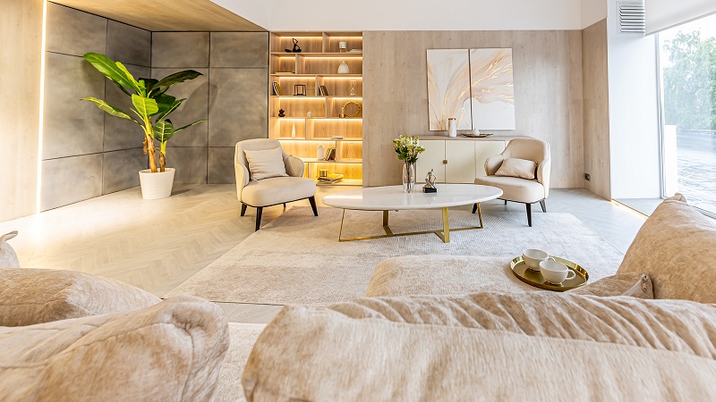
Pair strategic illumination with architectural height. Hang window drapery as high and wide as possible—mounting the rod just below the ceiling molding rather than directly above the window casing. Full-length, floor-to-ceiling linen curtain panels draw the eye toward the ceiling, visually expanding the room’s height. Incorporate tall bookcases, vertical gallery arrangements, and sculptural plants like a fiddle-leaf fig or olive tree to ensure the visual energy of the room stays elevated.
Selecting Furniture Silhouettes That Float Rather Than Sink
The silhouette of your furniture plays an outsized role in how heavy a carpeted room feels. Boxy, skirted sofas and bulky sectionals that sit flush on the floor create an oppressive feeling when placed over wall-to-wall carpet. They sink into the pile, making the entire room look weighted down and sluggish.
Whenever possible, choose furniture elevated on slender, well-proportioned legs. Sofas, accent chairs, and credenzas with exposed wood or metal tapered legs allow ambient light to circulate underneath. This open negative space creates a sense of airiness, giving the illusion that your furniture is floating lightly above the floor rather than bogged down by it.
Beige carpeting is rarely anyone’s first choice when designing an ideal space. But interior design is fundamentally the art of managing constraints with creativity and proportion. By balancing your undertones, covering high-traffic zones with structured rugs, elevating your materials, and drawing eyes upward toward dynamic vertical details, you transform an uninspired rental staple into a quiet, warm foundation that lets the rest of your design shine.
